Guys’ birthdays… ugh. I know that many of us have that same reaction to the prospect of making a masculine card. And for me the really frustrating part is that I struggle with it even knowing that most guys don’t care what the card looks like (at least if they are like my DH)! lol
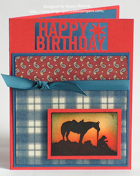
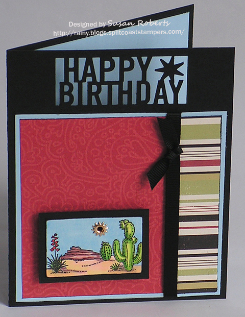
Well here is what I came up with for my brother-in-laws’ birthdays this month. I let Martha Stewart’s “Happy Birthday” punch do some of the work for me.
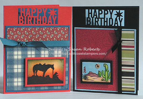
Rob lives outside of the city and has had/raised horses… well at least his wife has. But I love this image and thought he might like it, too.
Tim is a geologist. I thought a scene with a rock formation would be a good image for him.
In the end, I like the way these came out. *Phew* Hope the guys like ’em, too.
Happy Crafting!
——————————
Rob’s Card:
Stamps: Viva Las Vegastamps “Cowboy & Horse Silhouette”
Papers: Cardstock: Papertrey Ink “Vintage Cream”, “Enchanted Evening” and “Terracotta Tile”; Designer Paper: Graphic 45 A Proper Gentleman Collection “Cultured Reserve” and “A Proper Gentleman”
Inks: Memento “Tuxedo Black”; VersaMark; SU! More Mustard, Pumpkin Pie, Really Rust, Ruby Red and Not Quite Navy
Accessories: Martha Stewart “Happy Birthday” Punch; Papertrey Ink Twill Tape; Embossing Powder
Tim’s Card:
Stamps: SU! “Desert Scapes” (Retired)
Papers: Cardstock: Papertrey Ink “Spring Rain”, “True Black” and “Vintage Cream”; Designer Paper: DMD “Carefree Autumn”
Inks: Memento “Tuxedo Black”; Copics:


Accessories: Martha Stewart “Happy Birthday” Punch; GG Ribbon; Sun Eyelet


These are great guy cards! I love anything with a horse image, and I love the sunset/silhouette look you’ve created. The rock formation idea on the 2nd is so clever! I love the striped dp and that punched sentiment works perfectly! Nice job!
Oh, I’m sure they will. Great masculine that you tailor made for each of your brother-in-laws!
i love them!! i like you eyelet “sun”! very, very cool!
Great cards! They definitely should like them.
Susan I love these cards. That MS punch really does a lot for them. Your images and choice of papers is super! This is the second time today that I’ve seen this set of papers being used and now I’m driven to get some. These are just great guy cards. I’m sure they’ll love them – I know I do.
Gorgeous cards, Susan! You put so many thoughts and creativity in them! Really love the Happy Birthday letters! Love the combination of papers on the first one, goes so well with the theme of the card. Perfect choice of the stamp for Tim’s card! 🙂
Awesome cards, girl! Especially lovin’ the one with the horse…..the sunset colors are so vibrant and it looks amazing paired with that plaid DP!
I know whst you mean I also struggle with guy cards, love the images and the sunset on the one is so cool, great layouts, great inspiration!
I love your masculine cards…they are great. I think we all find it hard to do a guy’s card. I jump on my “car” stamps for them.
You did an awesome job. Pat
Oh wow!! I love both of these masculine cards Susan! They’re just awesome!!!
They are great guy cards. Simple and colorful, they will love them!
I love both of your masculine cards, Susan…and your sunset looks amazing! I love your punched sentiments as well!!
I’m sure they will love them. The grommet sun is perfect for the geologist card. I bet he doesn’t get that many things to take into account his unusual occupation. Very thoughtful!
Wow, they look excellent Susan, especially the punched out sentiment which looks like a silhouette. The colours are great guy colours.
That is one cool punch! Fabulous masculine cards…I love your choice of papers and colours, and the little scenes on each are done so beautifully!
What a COOL punch!!! I have not seen this one yet…thanks for sharing! Great lay out for using it too. I think I would have been at a loss if I just saw it in the stores.
Ahhh….the dreaded Man Card!!! You’ve done a fabulous job with these – great way to use the punch and fab images too!!!
What great guy cards, Susan…the MS punch is fabo and I love the colors and images you used!!! I gotta go to Michaels and check out that punch!!!!