Needed a birthday card for a friend who likes to keep things clean and simple but always seems to sport a little whimsical accessory. So I made this card and added just a touch of bling with the elegant single pearl.
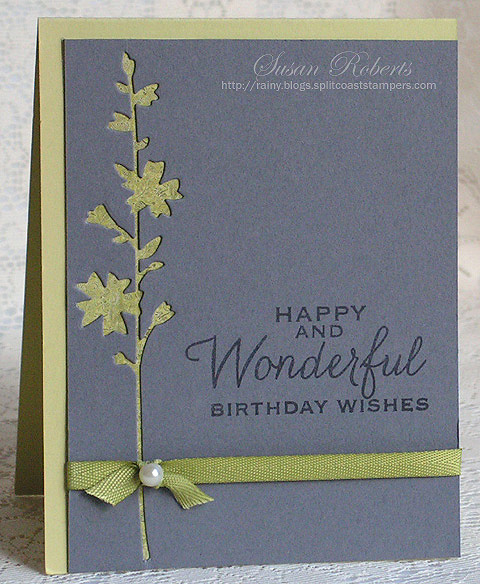
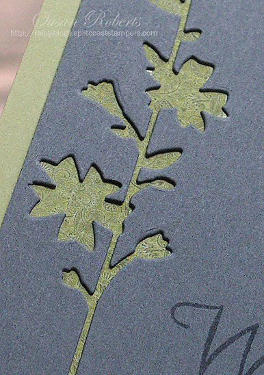
The gray card stock has a negative cut of the Hollyhock Stem Die. The design peeking through is a small piece of patterned paper that closely matches the color of the card base.
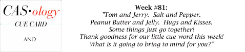
This card is playing in this week’s CAS-ology Challenge #81:
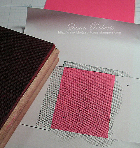
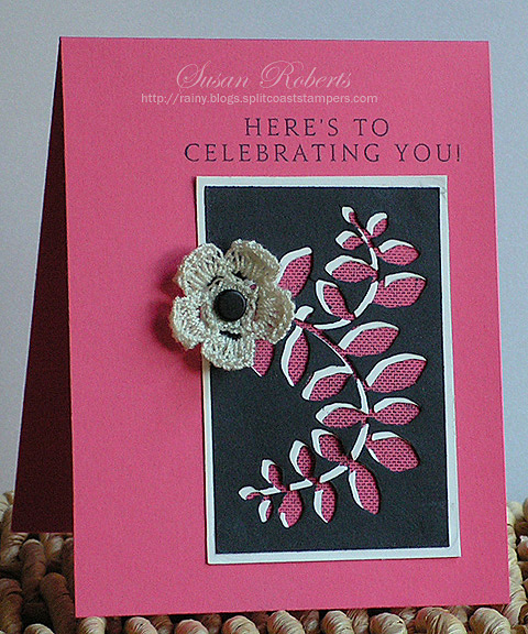
To get a pattern showing through the die cut portion of the paper without using a layer of patterned paper, the card base could be stamped instead. On this second card I masked off a small area on the card base where the pattern would show.
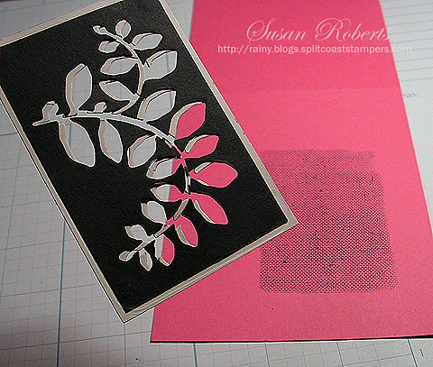
The leaves were die cut twice using contrasting colors of card stock. The black was then adhered to the cream slightly offset so that a shadow was created.
This card is playing in Papertrey Ink’s Make It Monday Challenge #151:

Happy Crafting!
——————————
Card #1:
Stamps: Hero Arts “Many Birthday Messages”
Papers: PTI Spring Moss; SU Basic Gray; BoBunny “Little Miss” Designer Paper
Inks: Memento Tuxedo Black
Accessories: Memory Box “Hollyhock Stem” Die; Darice Pearl; SU Old Olive Twill Ribbon
Card #2:
Stamps: PTI “Inside & Out: Birthday”; SU “Linen”
Papers: PTI Berry Sorbet, True Black and Vintage Cream
Inks: Memento Tuxedo Black
Accessories: Sizzix “Flowers, Branches & Leaves” Die Set; Crocheted Flower; Brad


I like the negative cut of the flower stem and how the paper is peeking out from underneath!
The pink card is gorgeous! Love that ‘shade’ effect and the handmade flower!
Great technique and beautiful cards!
These are such elegant cards, Susan. I love the subtle pattern peeping through on the first card. Beautiful.
Perfection twice! Very clever and pretty technique on the second card. I MUST remember that!
Two great uses of negative space! Lovely job on both.
Both cards are beautiful Susan, but I have to say my favorite is your Happy and Wonderful card… Love the crisp design and how you offset the layers on the card’s base.
Love the way you have used this hollyhock negative. Thanks too, for the pics on how you created the texture with the pink & cream card. Both are just so lovely. TFS & Hugs
Gosh. You make really elegant and classy cards. 🙂
Awesome cards! Especially love the first one. Also love your new blog border too Susan.
Thanks for sharing your technique for creating #2 – what a fantastic finished look! Both cards are sensational!
These both are so cool, I haven’t used my dies in this way yet and I love the effect, the double on the second is really cool look!
Lovely, love the pattern in the underneath die!! WOW!
Thanks for joining us at CASology!!
Alright, this one might be my favorite idea ever! 🙂 These are so cool and both such pretty cards! TFS!!
I love these! Simple and elegant !
Love the hollyhock stem card!